Order Confirmation workflow tasks
Order Confirmation workflow tasks in xSuite Web
The display of Order Confirmation workflow tasks in xSuite Web is now more closely oriented to the display in the SAP GUI.
At a glance, the user finds the status of the line item and, in the case of errors, also sources of error, which are highlighted.
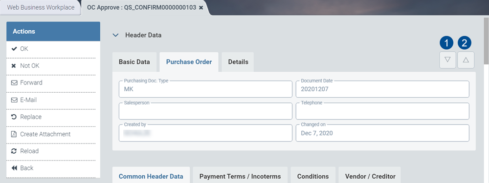
Display of multiple purchase orders in header data
The user can use the buttons Next Purchase Order (1) and Previous Purchase Order (2) to navigate from one purchase order to another in the header data.
Notice
The buttons will only be active if there is more than one order. If you are only handling one order, the buttons will be inactive.
Header-data extensions
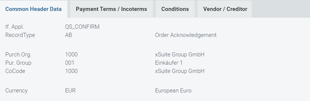
The Header Data area has been extended to include the following tabs:
Common Header Data
Payment Terms / Incoterms
Conditions
Vendor / Creditor
The data changes displayed change with the tab selected.
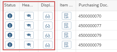
Buttons in the item-data section
Icon | Name | Description |
|---|---|---|
  | Error Status | When the button Error Status is clicked in an item row, the status overview of the items will open in a dialog window. Depending on the status of the items or confirmation items, the system will highlight data fields containing errors in red (error) or yellow (warning). The status of an item is based on the most negative status possible for the item. If the most negative status is a warning, the item will be highlighted in yellow. However, if the most negative status indicates anything more serious than a warning, the item will be highlighted in red. If there is neither an error nor a warning, the error status button will be green. |
 | Display SAP document | The user can now call up the SAP document in the Item Data area with the button Display SAP document . The SAP document is displayed in the xSuite Web portal with ITS service (Internet Transaction Server Service) (ME23N). |
 | Item Details (ID) | In the Item Data area, the user can view details on a line item using the Item Details button. The information is displayed in the Item Details area. |
Order Confirmation workflow tasks in SAP Fiori
The display of Order Confirmation workflow tasks in the xSuite App for SAP Fiori has been adapted to the display in the SAP GUI.
The columns Status und Header Data now appear before the column Item Details. The columnDisplay SAP document also appears when ITS is configured and activated.
Buttons in the item-data section
Icon | Name | Description |
|---|---|---|
 | Error Status | The dialog window Error Status with status information on the various item data rows can be invoked with the button Error Status. The icon of the button will already indicate the most negative type of status (Error, Warning, Success). |
 | Header Data | The Header Data button can be used to display the header data of a purchasing document. The header data will appear in a separate window. Using the drop-down box or the buttons in the header, the user can switch between the individual purchasing documents in the case of multiple purchasing documents without the user having to leave this view. With the Close button in the header ( |
 | Display SAP document | The button Display SAP document will only be shown if the ITS is configured and active in the xSuite App front-end settings. When you click the button, the SAP document will be displayed in the ITS. The same applies to the link in the column Purchase Order Item under Item Data in the Item Details area. If the ITS functionality is not active, the number of the purchasing document will be output as text rather than as a link. |
 | Item Details (ID) | The Item Details button allows display of the item details of the purchasing document. The item details will appear in a separate window. You can use the drop-down boxes or the buttons in the header to switch between the individual purchasing documents/items if multiple purchasing documents/items exist. The user does not have to leave the screen. Use the Close button in the header ( Fields of the confirmation items for which there are error messages or warnings (see Error Status button) are marked in color. |

