UI elements in the primary configuration screens
 |
UI element | Appearance in UI | How it works | |
|---|---|---|---|
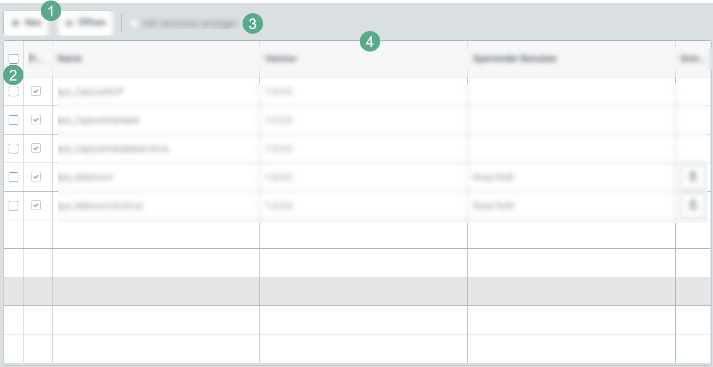
Button (1) |  | Clicking on this button will create a new element on the secondary level, depending on the tab. A new tab or dialog box will open for this purpose. | |
Button (1) |  | Clicking on this button will open all the objects selected in the individual view. | |
Button (1) |  | Clicking on this button will delete all the objects selected. | |
Button (1) |  | Clicking on this button will save all the changes made to a menu item. | |
Check box (2) |
| Clicking on the check box in the header of the table will select all check boxes of the entire column automatically. Thus, the selection applies to all cell contents in the table. | |
Check box (3) |  | Clicking on this check box will activate display of all versions of an element. | |
Check box (3) |  | Clicking on this check box will limit the view to changed elements. | |
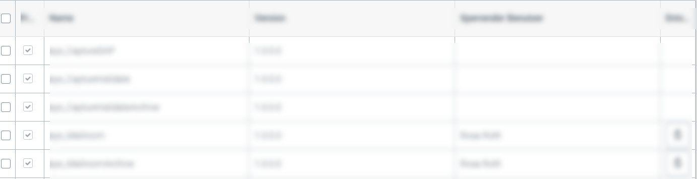
Table (4) |
| The tabular overview of the respective configuration menu item varies in terms of the number of columns and rows. The content, as well, is dependent on the respective menu item. Individual table row can be called up by clicking on the row or by selecting the check box at the beginning of the row and then clicking the Open button. This will open either a dialog box or a secondary configuration screen. |