Forms and scripts (V2)
 |
The Forms and Scripts menu item offers options for creating and editing custom forms and scripts. Forms are used to specify which index data of a work item is displayed. It is possible to add various types of fields to a form, such as text fields or drop-down lists.
Form scripts are used to evaluate user interactions with forms, modify form content, and implement form functions. Custom scripts can be created and edited, and then inserted into forms for use.
Creating a form script (V2)
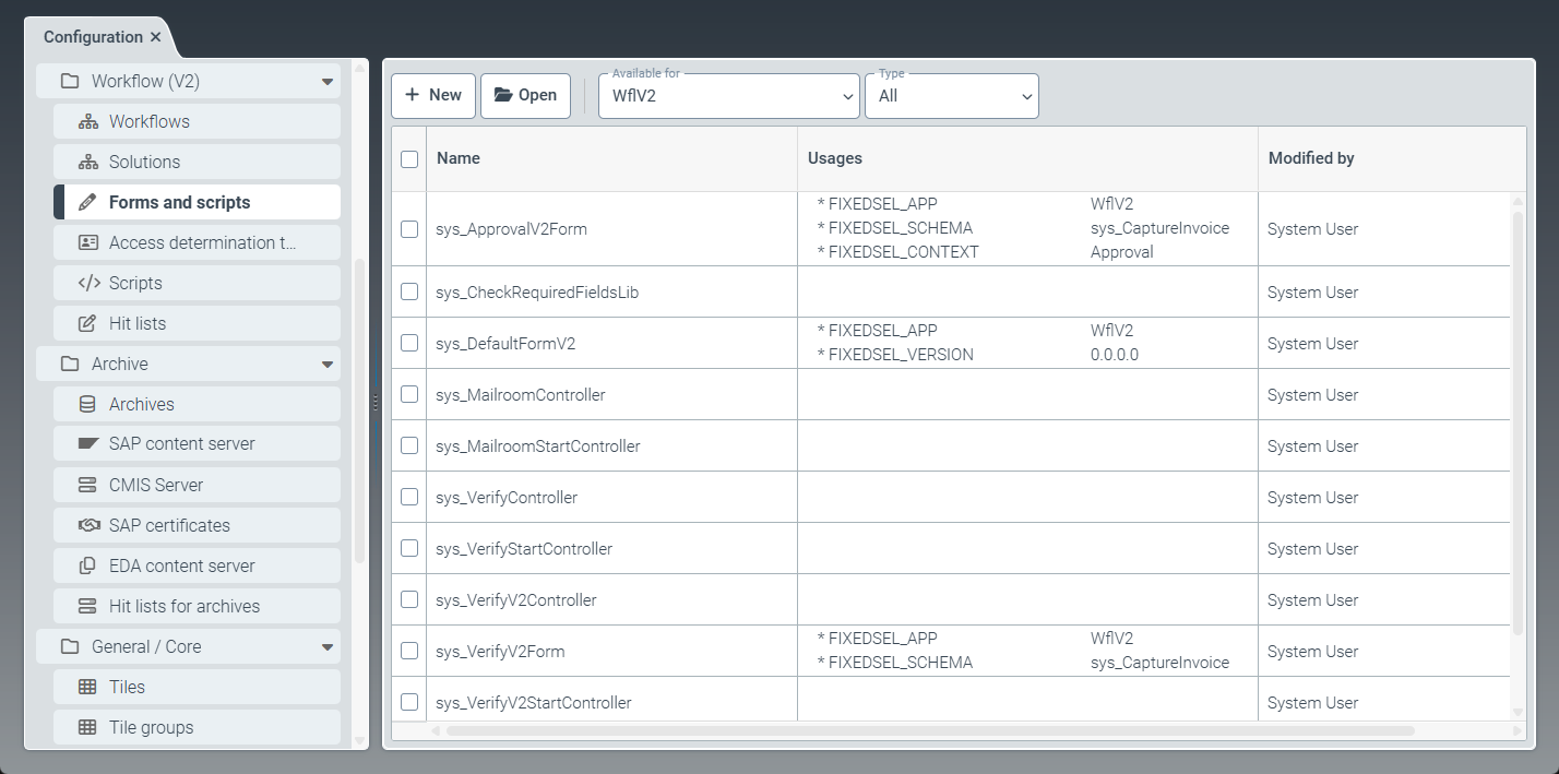
Select the Forms and scripts menu item, then go to New → Script.
➣ The FormScript: Unnamed item tab will open.
Click Save.
➤ The form script has been created. You can now use the script in forms.
Adding basic data to a form script
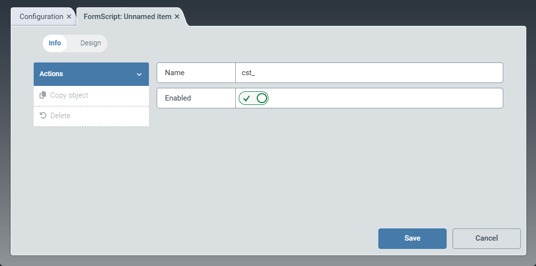
Click Info.
➣ The FormScript: Unnamed item tab will open in the Info view.
Enter the technical name of the form script in the Name field.
Notice
The technical name comes prepended with cst_. This prefix cannot be deleted.
Activate the Enabled toggle to activate the form script.
Tip
Only form scripts that have been activated can be used in forms.
Deactivating a script that is already integrated into and used by forms will prevent those forms from loading.
Click Save.
➤ The basic data of the form script has been saved.
Adding design data to a form script
Click Design.
➣ The FormScript: Unnamed item tab will open in the Design view.
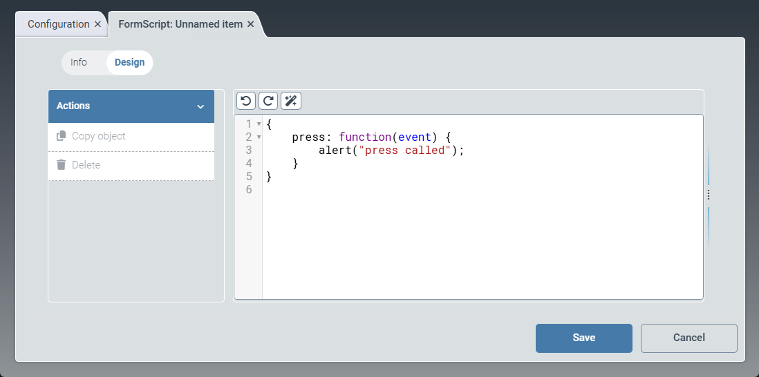
Enter the data for the script.
The script is a JavaScript file based on the OpenUI5 framework. You can use the data of a script that comes with the software (e.g., sys_VerifyV2StartController) as a starting point for custom script data.
Tip
The
 Undo and
  Redo buttons allow to undo or redo changes. Use the
  Format button to automatically adjust the formatting of the data.
Click Save.
➣ The design data of the form script has been saved.
Creating a form (V2)
A form consists of basic data and design data. Design data determines the actual content of the form (i.e., the fields, checkboxes, and buttons). Basic data includes the form's name, assigned scripts, and usage data.
Usage data is evaluated by the system to determine the workflow step in which a form is to be displayed. At runtime, the system automatically selects the appropriate form for each workflow step.
Select the Forms and scripts menu item, then go to New → Form.
➣ The Form: Unnamed item tab will open.
Click Save.
➤ The form has been created.
Adding basic data to a form
The Info view provides options for defining the basic data of the form. Basic data includes the name of the form, the assigned form scripts, and the usage data. The usage data is evaluated by the system to determine the workflow step in which a form is to be displayed.
The system considers usage data in which the workflow name is either empty (wildcard) or explicitly specified. The system also checks the corresponding schema, which is typically defined unambiguously by the workflow. The Schema context parameter can be used to specify a particular node name for which the form is valid. From all forms that meet the criteria, the system selects the form with the highest priority and displays it.
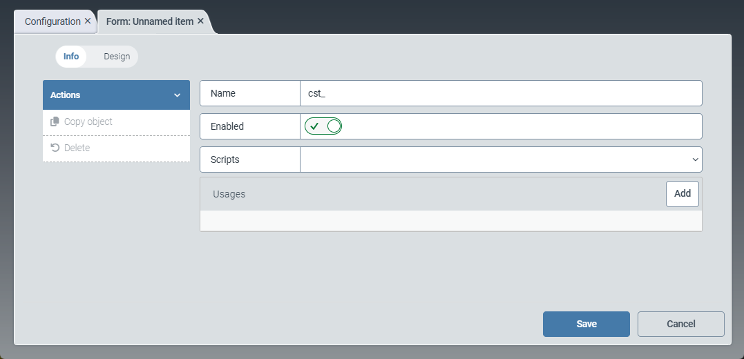
Click Info.
➣ The Form: Unnamed item tab will open in the Info view.
Enter the technical name of the form in the Name field.
Notice
The technical name comes prepended with cst_. This prefix cannot be deleted.
Activate the Enabled toggle to activate the form.
Use the Scripts drop-down list to select one or more scripts to use in the form.
In the Usages panel, click Add.
➣ The Edit usage dialog box will open.
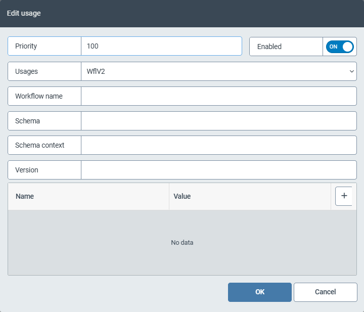
Edit the following fields:
Field
Instructions
Priority
Enter a number in the Priority field.
This number specifies the priority of the form. If there are several forms with the same usage data, the system uses the priority to determine which form is displayed. Higher numbers indicate higher priority.
Tip
We recommend specifying priorities in increments of ten. This makes it easier to add forms later on and/or change the priority of individual forms.
Enabled
Activate the Enabled toggle to activate the form.
If a form is not activated, the system does not use it. Instead, it automatically selects the form with the next-lowest priority.
Usages
From the drop-down list, select the workflows with which the form is to be used:
Any: Workflows of Version 1 and Version 2
Wfl: Workflows of Version 1
WflV2: Workflows of Version 2
Workflow name
Enter the name of the workflow for which the form is used.
Schema
Select a schema. For more information, see Schemas (V2).
Schema context
Specify a schema (optional).
Each workflow uses exactly one schema. The schema is specified when creating a workflow. If a work item is located in a UI node of a workflow, the system searches for the appropriate form for that node. You can specify the workflow schema for this search here.
Version
Enter the number of the workflow version for which the form is used.
The workflow version is only relevant for
WflV1workflows. The workflow version is not evaluated forWflV2workflows.If required, click the
 Add button to add a field together with the associated field value.
In this way, you can ensure that certain fields are displayed only when a specific value is entered in another field.
Click OK.
➣ The Edit usage dialog box will be closed.
Adding design data to a form
The Design view provides options for defining the content of the form. A variety of fields and containers can be added to the form and arranged as desired.
The content of a form is defined by an XML structure. Predefined XML elements are available and can be inserted into the XML structure using drag and drop. Alternatively, the XML data can be entered manually. A preview of the form with the current XML structure is displayed on the right.
Click Design.
➣ The Form: Unnamed item tab in the Design view will open.
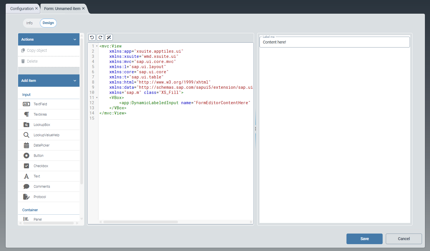
Drag and drop one or more of the following input elements from the Add item menu:
Tip
The
Undo and Redo buttons allow to undo or redo changes. Use the Format button to automatically adjust the formatting of the data.Element
Description
Text Field
For creating a single-line text field.
Text Area
For creating a multi-line text field.
LookupBox
For creating a drop-down list.
LookupValueHelp
For creating an F4 value help.
DatePicker
For creating a date field with integrated calendar selection.
Button
For creating a button that you can name individually.
Checkbox
For creating a checkbox.
The checkbox can later be enabled or disabled in the user interface by clicking it.
Text
For creating a text that is displayed to the user.
The user can only read the text, but not edit it.
Comments
For creating a comment option.
The button New comment allows the future user to create a new comment in the user interface.
Protocol
For creating an automatic log.
The log records who made what change to the work item, at what time.
The user can thus better understand the editing process.
Drag and drop one or more of the following container elements from the Add item menu:
Element
Description
Panel
This element is an expandable area (e.g., the subareas in the Workflows menu item).
Splitter
This element divides a container into 2 adjacent panels, separating them from each other by a visual boundary.
Vbox
This element arranges subcomponents vertically, allowing the list to continue in downward direction.
HBox
This element arranges subcomponents horizontally, continuing to the right.
Click Save.
➣ The design data of the form will be saved.